Service
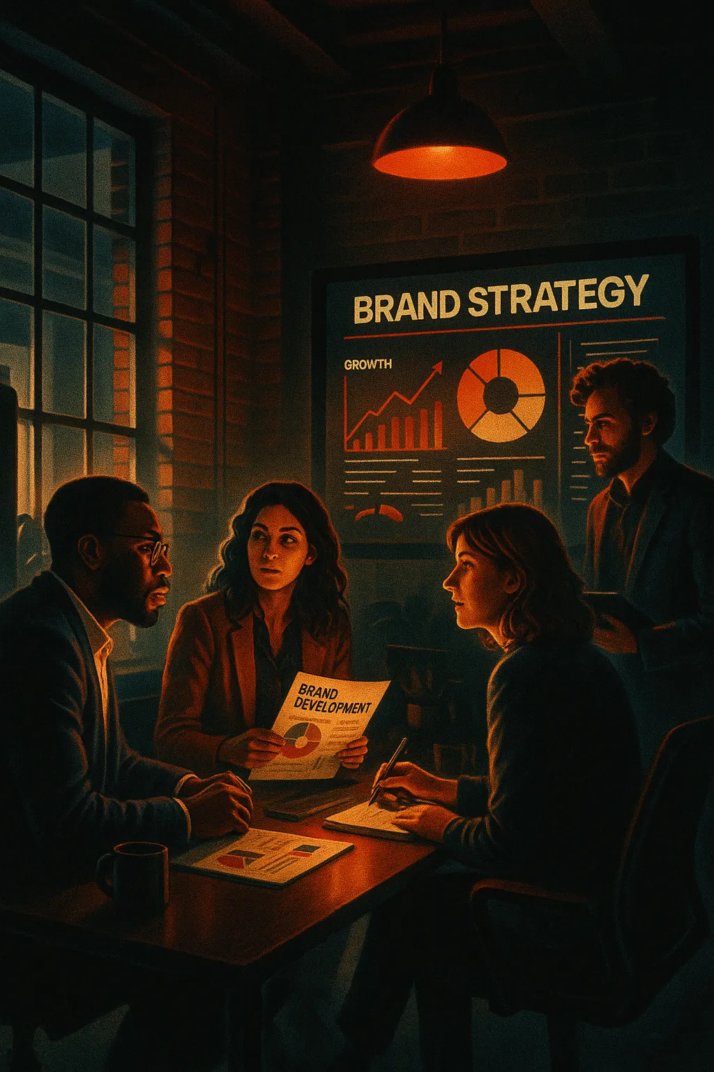
Logo And Brand Development for Increased Qualified Leads and Conversions

Logo and brand development shapes how your business is recognized, remembered, and chosen when prospects compare options online. When service pages are getting traffic but few inquiries, the issue is often not just SEO or ads. It is brand positioning. If your visuals look inconsistent, outdated, or disconnected from your value, visitors hesitate. That hesitation turns into lost leads and wasted ad spend. A clear brand system supports higher click through rates, stronger engagement, and more qualified conversations because it builds trust before a sales call ever happens.
In practice, brand performance is tied closely to how your website is structured and discovered. We often see businesses managing dozens of service pages with inconsistent messaging, weak internal linking, and visual elements that dilute authority. Poor site architecture and unclear hierarchy confuse both users and search engines. Slow page speed, oversized image files, and unoptimized media assets further reduce engagement. Content gaps between brand messaging and keyword targeting also limit visibility, especially when expanding into new services or locations.
At RockN' Socials, we approach brand work with structured optimization roadmaps that connect design decisions to search visibility diagnostics and conversion data. Our process includes documented brand standards and measurable alignment through search visibility reports. We commonly support local service businesses and growing companies relying on inbound leads. On this page, you will see how our framework turns visual identity into a measurable growth asset.
What You Get
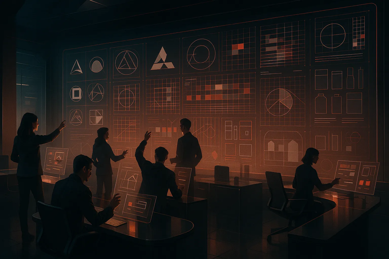
You receive a complete brand identity package built for clarity, consistency, and real-world use. Every deliverable is structured so your team can apply it across websites, social media, print materials, and advertising without confusion.
Deliverables
Logo design concepts
3 initial logo concepts presented in mockups showing digital and print applications. Each concept includes primary logo, alternate layout, and icon mark.Refined logo system
One finalized logo suite with horizontal, stacked, and icon variations in color, black, and white formats. Files are delivered in PNG, JPG, SVG, and vector formats for web and print use.Brand identity development document
A structured brand foundation document outlining mission, positioning statement, brand voice, audience profile, and messaging pillars.Typography systems
Primary and secondary font selections with usage rules, hierarchy examples, and web-safe alternatives. Includes heading, subheading, and body text structure.Color palette creation
Core and accent color palette with HEX, RGB, CMYK, and Pantone values. Includes guidance for contrast, accessibility, and background usage.Brand kit documentation
A detailed brand guidelines PDF that defines logo spacing, clear space rules, incorrect usage examples, typography structure, color standards, and visual consistency rules.Visual identity asset set
Social media profile graphics, favicon, and basic brand pattern or graphic element for consistent digital use.Project milestone reporting
Structured progress updates at key stages including concept presentation, refinement review, and final approval.Final brand delivery package
Organized digital folder containing all approved assets, source files, exported formats, and brand documentation.
Tools and Access
This service is managed inside the RockN' Socials CRM for communication, file sharing, approvals, and milestone tracking.
Logo concepts and brand assets are created using professional graphic design software, typography tools, brand development systems, and visual identity platforms to ensure file accuracy and scalability.
You will not need access to these tools directly. However, we may request temporary access to your website or hosting platform if logo placement previews are required.
What You’ll Be Able to Review
You will review structured concept presentations that show how each logo works across websites, business cards, and social platforms.
You will receive a brand identity development document outlining positioning and messaging before final visual approval.
During refinement, you can review annotated logo drafts with clear change notes and revision summaries.
At completion, you will receive a complete brand kit documentation file that serves as your long-term reference guide. This document allows internal teams, designers, and marketing vendors to maintain consistency without guesswork.
All final assets are delivered in organized folders with labeled files so they are easy to locate and use.
What We Need From You to Start
To begin, we need:
Business information including services, products, and long-term goals
Brand positioning details such as target market and competitive landscape
Target audience information including demographics and buying behavior
Any existing logos, brand materials, or visual preferences
Examples of brands you like or dislike
A primary point of contact for feedback and approvals
Clear input at the beginning allows the brand identity to reflect your business accurately and reduces unnecessary revisions.

How We Evaluate and Improve Performance
Strong brands are not built on opinion alone. Every decision in our logo and brand development process is guided by structured evaluation, documented criteria, and measurable brand alignment standards.
Data Sources We Analyze
We begin by reviewing all available brand inputs inside RockN' Socials CRM. This includes business goals, target audience profiles, competitor positioning notes, and internal stakeholder feedback collected during discovery.
Within our brand development systems and visual identity platforms, we analyze:
Audience positioning clarity
Competitive differentiation gaps
Visual consistency across touchpoints
Typography readability across print and digital formats
Color contrast performance and accessibility compliance
Using graphic design software and typography tools, we test logo scalability, spacing, alignment, and legibility at multiple sizes. A logo that looks strong on a desktop header may fail when reduced to a social icon or packaging stamp. These technical checks prevent performance issues after launch.
We also review how the proposed identity translates across real use cases such as website headers, social graphics, business cards, and signage. This helps us evaluate functional consistency, not just aesthetic appeal.
Example Findings We Often Identify
During evaluation, we frequently uncover issues such as:
Logos that lose clarity when scaled down
Overly complex symbols that do not reproduce well in one color
Typography systems that lack hierarchy or consistency
Color palettes that create contrast problems in digital use
Brand positioning statements that do not match visual tone
We document each finding with visual mockups and comparison examples. This allows stakeholders to see how inconsistencies affect perception and usability. Addressing these issues improves recognition, usability, and long term adaptability.
Example Analysis Scenario
A common situation occurs when a business likes a logo concept internally, but early applications feel inconsistent. For example, the logo may appear bold and modern, while the supporting typography feels traditional and formal.
In this case, we compare:
Typography structure and weight balance
Color psychology alignment with target audience
Symbol geometry versus brand positioning
Visual consistency across mockups
By reviewing these elements side by side in our visual identity platforms, we determine whether the issue stems from font pairing, spacing ratios, or color tone mismatch. Only after isolating the cause do we recommend adjustments.
This structured comparison prevents subjective debate and keeps decisions grounded in measurable design principles.
Real Tool Workflow
Our workflow connects multiple tools to validate decisions from different angles.
RockN' Socials CRM centralizes discovery insights and brand direction notes. Graphic design software is used to test spacing grids, alignment systems, and scalability. Typography tools evaluate kerning, hierarchy, and cross platform readability. Brand development systems document rules for consistent usage. Visual identity platforms simulate real world applications.
By comparing outputs across these tools, we avoid relying on a single visual impression. Each platform provides a different validation layer, reducing the risk of missed inconsistencies.
How Improvements Are Prioritized
Not all improvements carry equal weight. We prioritize based on:
Impact on brand clarity and recognition
Risk of inconsistency across applications
Scalability across digital and print formats
Alignment with long term positioning goals
Ease of implementation within the project timeline
Structural clarity and usability issues are addressed first, since they affect every brand touchpoint. Refinements such as spacing adjustments or secondary color tuning follow once core alignment is confirmed.
This prioritization ensures the final brand system is both visually strong and functionally reliable across all applications.
Who This Is For
This service is designed for businesses that want measurable improvement in how their brand is perceived in the market. It is built for organizations that understand brand identity affects trust, pricing power, and long-term growth. If you want a clear, consistent brand that supports customer acquisition and premium positioning, this process is built for you.
Good Fit
This service works well for:
New businesses launching a brand that need a strong, professional identity from day one.
Companies going through a rebrand due to growth, new leadership, mergers, or market repositioning.
Businesses moving upmarket that need visuals aligned with higher pricing and a more refined audience.
Organizations with inconsistent branding across website, print, social media, and sales materials.
Companies expanding locations or services that need a scalable identity system, not just a single logo.
These businesses usually see branding as a long-term asset, not just a design project.
Common Starting Situations
Many clients come to us after noticing issues such as:
A logo that feels outdated or overly generic
Brand visuals that look different across platforms
Marketing materials created at different times with no consistent system
Internal debates about colors, fonts, or messaging direction
Difficulty standing out in a crowded market
Often, the business has grown, but the brand has not evolved with it. The result is confusion, mixed signals, or a weaker first impression than the company deserves.
Not a Fit
This service may not be the right solution for:
Businesses looking for a quick, low-cost logo without strategy
Companies expecting overnight brand transformation
Organizations unwilling to participate in discovery or feedback
Teams that cannot implement brand standards consistently
Strong brand development requires planning, collaboration, and long-term thinking.
Our Process
Strong brand outcomes come from a structured process, not random design changes. Our workflow keeps decisions grounded in your business goals, your audience, and how the brand will be used across real channels. This helps the final identity feel consistent, intentional, and easy to apply.
Step 1: Initial Assessment
We start by reviewing your current digital presence to understand what already exists and what needs to change. This includes your website, social profiles, and any public-facing materials that shape first impressions.
We look for gaps and patterns such as inconsistent visuals, unclear messaging, or designs that do not match your pricing, service quality, or target market. If you have an existing logo, we assess how it performs in common situations like small sizes, dark backgrounds, and mobile screens. This step matters because it shows the real starting point and prevents decisions based on guesswork.
Step 2: Strategic Planning
Next, we turn the assessment into a clear plan. We define what the brand needs to communicate and what it must avoid. This includes clarifying your positioning, identifying your audience’s expectations, and choosing a visual direction that matches how you sell and deliver value.
We also set practical rules for the identity, such as how formal or friendly the tone should feel, what visual styles fit your industry, and what applications matter most (for example, website headers, social avatars, email signatures, or signage). This step matters because it creates alignment before design work begins, reducing rework later.
Step 3: Implementation
With direction approved, we move into design and build. We create initial concepts, then narrow toward a single direction based on feedback and the goals set in planning. Each revision round focuses on specific improvements, such as readability, balance, spacing, and how well the design holds up across different sizes.
We also build the supporting brand elements needed for consistent use, including typography choices, color rules, and supporting graphics. If needed, we test placements in real layouts so the identity feels natural in the places it will be seen most. This step matters because a brand is not just a logo—it is a working system.
Step 4: Monitoring and Measurement
After the new identity is delivered and applied, we review how it performs in the real world. This can include checking visual consistency across your website and profiles, confirming files are being used correctly, and watching for common issues like stretching, poor contrast, or incorrect colors.
We also collect internal feedback from your team on usability, such as whether assets are easy to find and whether guidelines are clear enough for daily use. This step matters because small execution issues can weaken the brand quickly if they go unchecked.
Step 5: Continuous Refinement
As your business grows, brand needs can change. We use ongoing observations to guide updates, such as adjusting assets for new channels, improving consistency in new materials, or refining elements that are not working as expected.
This step matters because a brand should stay stable while still supporting new use cases over time, keeping your presentation clear as your marketing expands.
Pricing
Pricing for an identity and visual system depends on the scope of work, technical complexity, and the long-term needs of the business. Projects vary widely because some clients need a simple mark and color system, while others require a full suite of assets, usage guidelines, and implementation across many channels.
Projects typically start around $2000/Brand Kit — for small businesses or startups needing a simple mark, basic color palette, and primary typography.
Most businesses invest between $2,000-$30,000/Brand Kit — for mid‑level packages that include multiple logo variations, extended typography and color systems, application mockups, and basic guidelines.
Larger or more complex implementations may range $50,000+/Brand Kit — for enterprise work that includes extensive research, multiple stakeholder rounds, full identity systems, and cross-channel rollout plans.
Common factors that influence final pricing include:
size of the website — larger sites often require more visual assets and templates.
number of pages or services involved — more pages or product lines need additional lockups and style variations.
technical complexity — custom file formats, icon systems, and production-ready assets add time and cost.
competitiveness of the market — crowded categories may require deeper research and differentiation.
level of ongoing support required — retainer work, updates, or asset management raise the investment.
current condition of the website — outdated or inconsistent assets can increase scope to ensure cohesive implementation.
Most engagements begin with a discovery consultation or design review to define the right scope and budget. That initial step helps ensure the final investment matches the business goals and only pays for the improvements that will deliver real value.

Next Step
The next step is a consultation to understand your business goals and current situation. We will listen to your needs and gather context about where your organization stands.
During the conversation we clarify priorities, scope, timeline, and level of work. That discussion helps focus efforts on the most important areas and shows how the engagement could be organized.
The purpose of the conversation is to identify practical opportunities and determine whether the service is a good fit. It also helps assess whether the approach aligns with your goals and available resources.
If you would like to explore the service further, you can schedule a consultation.